Pizza Uno Website Audit & Detailed Analysis
Before redesigning the Pizza Uno experience, I used this project to diagnose what was and was not working. It is a case study in reviewing a live digital product with both user experience and business communication in mind.
Project Story
This project matters because effective redesign starts with useful diagnosis. It shows how I break down an existing experience before deciding what should change.
Challenge
Identify where the Pizza Uno website supported customer actions well and where layout, clarity, or structure created friction.
Approach
Review the site page by page, record strengths and weaknesses, and turn those observations into practical recommendations for a stronger rebuild.
Outcome
A structured audit that created a stronger basis for redesign. The next stage could respond to specific issues rather than rely on guesswork.
Project Snapshot
This section turns the audit into a faster professional read by making the review role, tools, and resulting value much more explicit.
Audit Method
This visual layer shows how the review was structured and why the audit creates a stronger bridge into the implementation project that follows it.
Review the live experience page by page to identify friction in structure, clarity, and trust.
Separate stronger areas from weaker ones so the redesign direction is evidence-led rather than assumed.
Translate the findings into a more usable brief for the rebuild and later front-end implementation.
What This Demonstrates
This case study shows that I can evaluate digital products critically, not only build them. That makes later implementation work more credible.
Core Strengths
- Website analysis and UX observation
- Structure and content review
- Business and technical thinking combined
- Audit-first workflow before implementation
Why It Matters
For employers, this helps show that I can identify weak spots, communicate them clearly, and set up a more intelligent path to improvement.
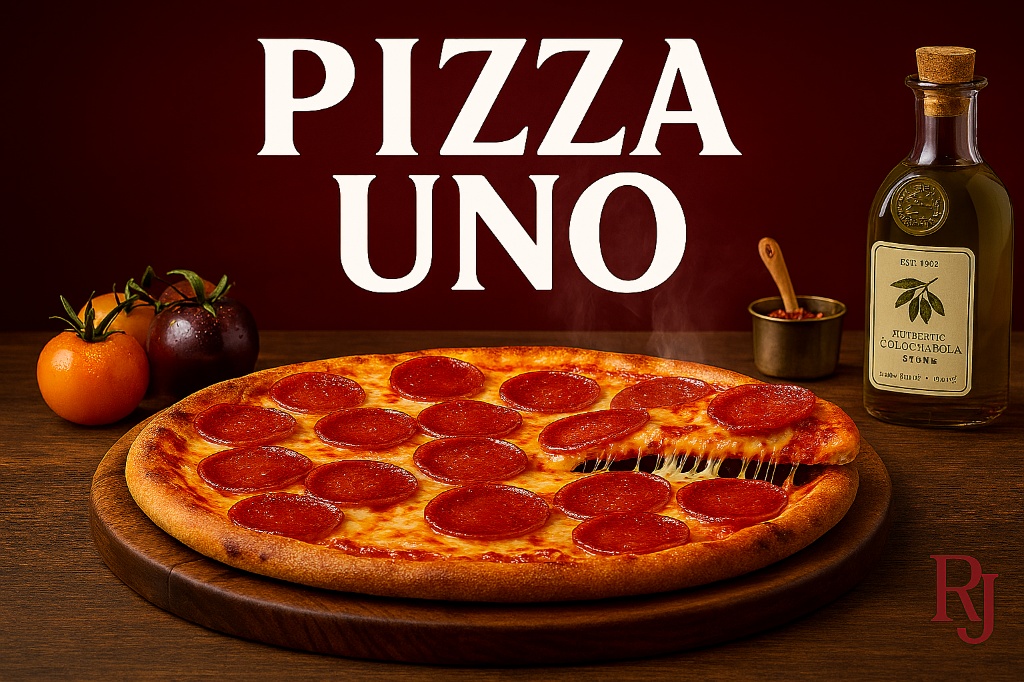
Before and After Direction
The audit and rebuild work are strongest when seen together: one identifies the friction and the other shows how that direction can be improved visually.
Audit Lens
The earlier stage focused on identifying layout, communication, and structural issues across the original experience.
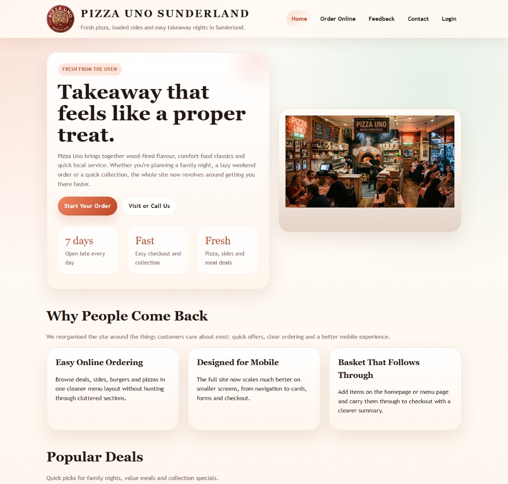 Rebuild Direction
The follow-on implementation responds to those issues with a cleaner visual hierarchy and stronger ordering flow.
Rebuild Direction
The follow-on implementation responds to those issues with a cleaner visual hierarchy and stronger ordering flow.
Archive Access
The original long-form converted report is preserved separately for full review.
Open the archived report version to review the complete Pizza Uno analysis document.